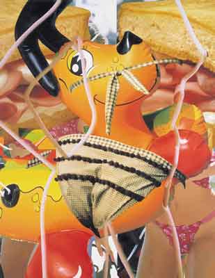
Courtesy Sonnabend Gallery
HOT DOG 2002
Oil on canvas
84 X 108 inches
Jeff Koons: what art is to begin withby Donald Goddard |
|
|
Picasso and Matisse, or any other artist of the 20th century for that matter, didn't do character studies either. Rather, they sensualized space. And so does Koons, but literally, in a way that could only be done after the invention of (and De Kooning's incorporation of) the pin-up girl. All the paintings have principal female figures, filling most of the surfaces, which appear and disappear as shapes and outlines into and space out of landscapes, items of food, fences. Faces are not seen. They are cut off or turned away or superimposed with other images--the hair of a larger head and some yellow substance in Gate so that she looks something like one of Max Ernst's composite creatures, a bagel with cream cheese in Bagel. So the paintings are all legs in netted stockings, skimpy bathing suits, long hair, bare midriffs, glimpses of breast and pudenda, cream cheese, butter, slices of ham and bread, adorable inflated toys. The shapes bend and squirm and intertwine with extraordinary grace. Space is consumed by image, a space into which Koons had entered himself in earlier paintings. Reality is what one wants it to be--almost naked ladies with no faces, bright beautiful days--or what the culture wants it to be. If something is good and undeniably appealing, like a puppy dog, it becomes even more so, to the enth degree, like Koon's gigantic Puppy sculpted in flowering plants (shown in New York last year). It becomes inescapable, undeniable, and an exaltation of image, which is what art is to begin with, something like the Byzantine icons of Christ and the saints. |
|
|
For a moment the world is that way, the fulfillment of fantasy. But then it is difficult to reconcile the screens, the fences, the chains, and ultimately even the netting of the stockings, and most prominently the barred and heavily screened door of Gate, which fills most of the left side of the painting as the young woman places her hand on its knob. The images themselves are screened, as they might be on a computer (from which these images seem to derive). The image doesn't exist without the screen, as any picture might be said not to exist without a grid of some kind, without a pattern of thought. Grid and image are enemies but bound together, like the inflated blue and white dolphin and the rack of pots and pans hanging from its belly. |
|
Courtesy
Sonnabend Gallery |
Dolphin presents something as familiar as bathing beauties to anyone in modern consumer culture--utensils that might be seen in this ideal configuration in a department store or someone's kitchen. But they aren't in a kitchen; they are in an art gallery hanging by chains from a large toy marine mammal that itself is hung by chains from the ceiling. Everything is changed. Why can't one simply consider this a fun way to install what every sophisticated homeowner should have? After all, the dolphin does remind us that people kill animals and cook them. It belongs even though the dolphin itself is no longer fair game. Of course, that prohibition in itself might be enough to throw someone off; but there are other questions or confusions. The pots and pans are heavy; the dolphin is light, filled with air. There are moments despite the handles and the plastic sheen when one might slip into thinking of the dolphin as a real animal and therefore how excrutiating it must be that heavy metal objects are hanging from its flesh. And finally, we are in the dolphin's realm, deep under water, drowning perhaps, as it soars overhead with its markings of blue sky and white clouds camouflaging it from predators below. Donald Goddard © 2003 |
Art Reviews Listings - Previous Review - Next Review
Art Review - NYArtWorld.com - NYAW.com. All artwork is copyright of the respective owner or artist. All other material © Copyright 2015 New York Art World ®. All Rights Reserved.
New York Art World ® - Back to Top